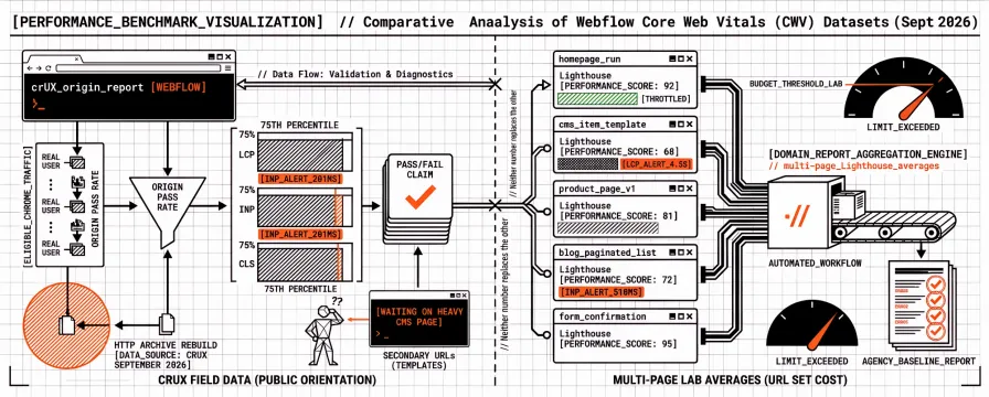
Public Core Web Vitals numbers for Webflow usually arrive as origin pass rates. Large HTTP Archive rebuilds from Chrome UX Report data put Webflow well above the all-web average on mobile in September 2026, and vendor how-tos still start from a single homepage PageSpeed Insights run. An agency with a book of Webflow marketing sites needs a different baseline. What do multi-page lab averages look like once home, CMS templates, and conversion URLs sit in the same domain report?
Neither number replaces the other. Field pass rates describe eligible Chrome traffic at the origin; multi-page Lighthouse averages describe the templates you still have to budget and schedule. Agencies hear both stories in the same week: a CrUX chart that says Webflow origins pass often, and a client who still waits on a heavy CMS page. What follows publishes a reproducible Watcher sample from client-tagged Webflow sites, sets it beside public CrUX orientation, and points at the work that usually moves the needle first. The method matches our Shopify, WordPress, Magento, and fashion benchmark posts. The key distinction: CrUX tells you what real users experience, while lab averages show what your URL set actually costs under throttling.
What counts as a reliable Webflow Core Web Vitals benchmark in 2026
For Core Web Vitals, the strongest public field source remains the Chrome UX Report (CrUX). Google’s methodology is clear about inclusion: pages and origins must be publicly discoverable and popular enough, data comes from eligible Chrome users, and thresholds are read at the 75th percentile over a rolling window. That is why Search Console and the field section of PageSpeed Insights matter for ranking and real-user claims, while a single Lighthouse run remains a diagnostic tool.
Google’s published thresholds are unchanged for the three metrics:
Metric | Good (p75) | Needs improvement | Poor |
|---|---|---|---|
LCP | ≤ 2.5 s | 2.5 s – 4.0 s |
|
INP | ≤ 200 ms | 200 ms – 500 ms |
|
CLS | ≤ 0.1 | 0.1 – 0.25 |
|
An origin or URL group passes Core Web Vitals when all three sit in the good bucket at p75. A Lighthouse Performance score blends lab timings under throttling and is useful for regression detection, not as a substitute for CrUX pass/fail. If you need a refresher on the three metrics themselves, start with What Are Core Web Vitals? A Practical Guide for 2026.
A useful Webflow benchmark therefore states four things up front: which clock (CrUX field versus Lighthouse lab), which URLs (homepage only versus CMS collection templates and conversion paths), how scores are aggregated (single URL versus median or mean across pages), and the collection window. Webflow’s own performance panel and agency checklists often quote one green score without that scaffolding. Agencies managing a mixed Webflow book need the scaffolding more than another screenshot.
That scaffolding also decides whether “Webflow Pagespeed” advice applies. A guide that only optimises the Designer canvas on the home page can leave CMS item templates, paginated blog lists, and form confirmation pages untouched. Those secondary URLs still consume lab averages in a domain report and still shape how clients experience the site after the first click.
Public CrUX context for Webflow in 2026
Independent researchers combine HTTP Archive technology detection with Chrome UX Report data and publish builder pass rates that orient a portfolio conversation. Rebuilds of the HTTP Archive Core Web Vitals Technology Report for September 2026 place Webflow at about 71.3% of mobile origins passing all three Core Web Vitals (roughly 59,000 Webflow origins in that cut), against about 52.8% for all measured origins. Among Webflow sites in the top one million origins, the same rebuilds drop the all-three pass rate to about 49.8%. Per-metric good shares for all Webflow mobile origins in that month sit near 78.6% LCP, 88.0% INP, and 93.6% CLS. PageSpeed Matters’ CMS study also places Webflow above WordPress on mobile pass rate in its sample, even when absolute percentages differ by filter and date. US-only CrUX cuts (for example Stackra’s August 2026 platform table) often show still higher Webflow pass rates than global samples, which is another reason to name the geography and filter before you brief a client.
What those studies agree on matters more than the exact percentage. Webflow’s hosted edge gives many origins a favourable start in the field. Busy sites and richer templates lose that lead. Loading (LCP) is still the metric that fails first when traffic and design complexity rise, which matches what agencies feel when a client’s Search Console “needs improvement” is almost always an LCP story rather than a CLS lecture. INP and CLS look healthier in the same public tables, so a retainer that only celebrates a green CLS badge while ignoring LCP on CMS templates is answering the wrong question.
Treat public CrUX tables as orientation for the platform, then measure the URL set you actually retain. A homepage that passes origin-level CrUX can still hide slow CMS templates that never earn enough traffic to appear at URL level. Multi-page lab averages are how you catch that before the retainer review. The contrast with WordPress is useful here: public CrUX often paints Webflow as the healthier builder, so clients arrive expecting green field scores, while agencies still need a lab baseline for the URL set they maintain every sprint. Always name the clock you are quoting — a green CrUX pass does not guarantee good lab averages across your URL set, and chasing lab scores without field data can lead to misplaced priorities.
Multi-page lab sample from Watcher Webflow clients
We keep Webflow-tagged client sites in Watcher and run multi-page PageSpeed Insights analyses that store Lighthouse lab metrics per selected URL. For this snapshot we took the latest domain report for every site with platform_cms=Webflow and a client tag, and an aggregated report payload (n = 109 sites). Reports were generated between 1 September and 15 November 2026. Earlier inventory work in late October counted about eighty-four Webflow client rows with reports; the November refresh picks up newer domain reports and additional tagged clients, so the published n is 109.
Each report averages Lighthouse metrics across the URLs selected for that domain (median 15 analysed pages per site; 1,705 page runs in total). Values below are store-level averages of lab runs, not single-URL CrUX p75s. A site that looks healthy on one marketing page can still drag the average when CMS templates, blog layouts, and form pages are included, which is the usual Webflow pattern once shared interactions, custom code, and third-party embeds repeat across templates.
Selection is intentional, not a crawl of every published CMS item. Agencies typically include the home page, one or two high-traffic marketing URLs, representative CMS collection templates, and at least one conversion path. That mix is enough to expose template drag without burning PageSpeed Insights quota on every archive page. It also matches how retainers actually work: you budget and schedule the URLs you promised to watch, then widen the set when a template regresses. If a client later adds a heavy CMS collection or a new embed on every layout, re-run the same URL set before you argue about whether Webflow hosting “got slower.”
Mobile and desktop Lighthouse Performance
Slice | Mobile Performance (avg) | Desktop Performance (avg) |
|---|---|---|
Minimum | 27 | 43 |
25th percentile | 48 | 67 |
Median | 55 | 78 |
75th percentile | 65 | 85 |
Maximum | 99 | 100 |
Mean | 57 | 75 |
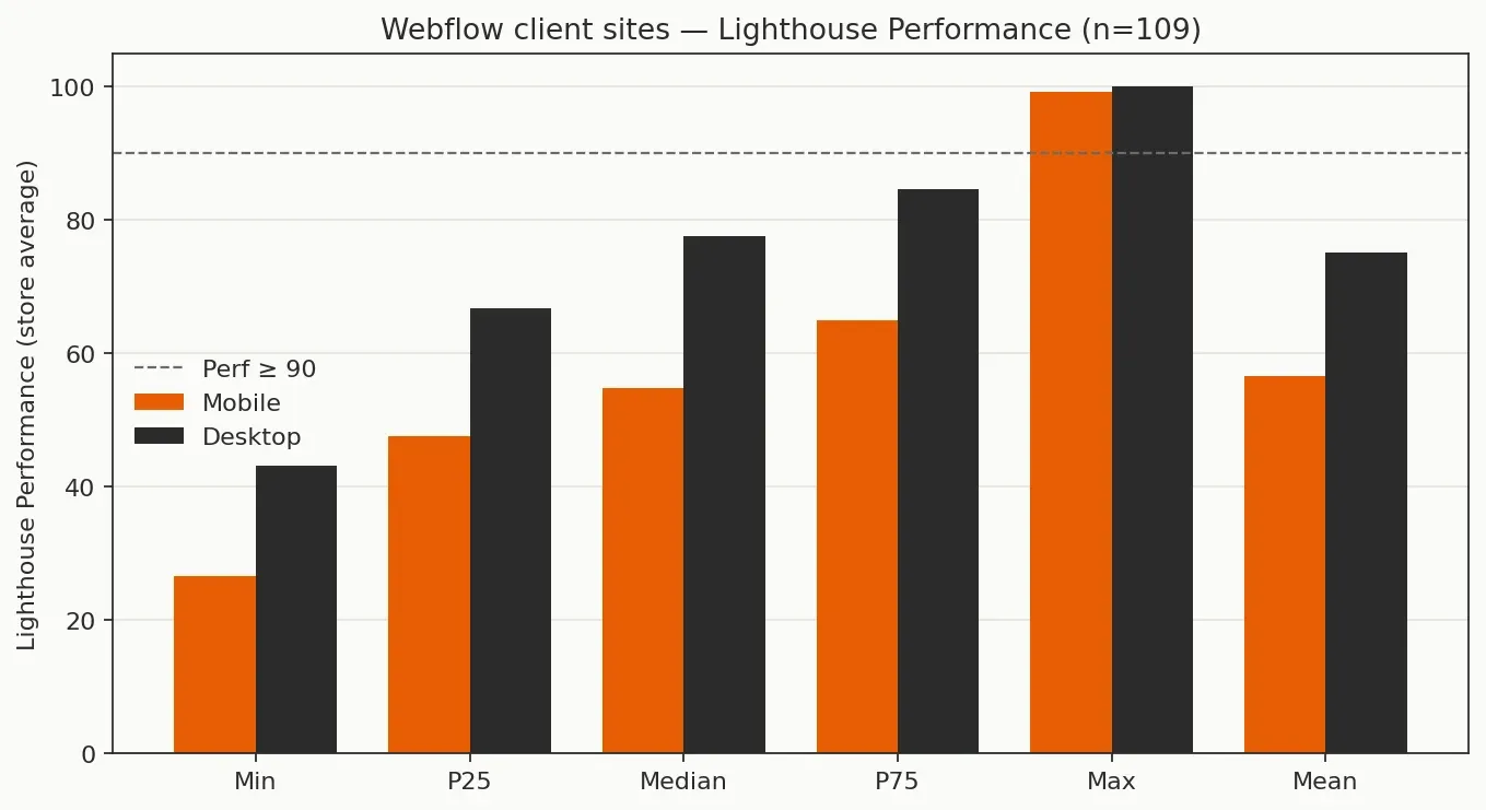
Half of the sample sits at or below a mobile Performance average of 55. 72 / 109 sites clear a mobile average of 50, 18 / 109 clear 70, and 3 / 109 reach a mobile store average of 90. Desktop is kinder in the same runs (median 78), which matches what agencies see when a client forwards a desktop-only screenshot and assumes the Webflow site is fine. Compared with our WordPress Watcher sample (median mobile Performance 62 on 381 sites) and Shopify sample (median about 51 on 64 stores), this Webflow client set sits between those two on the Performance dial. Magento’s verified Watcher sample (median about 58 on 76 stores) sits in the same band. The shared pattern still matters more than the gap: multi-page lab averages remain a remediation queue, not proof that monitoring can stop, and not proof that a builder’s marketing claims transfer to every client template.
Mobile lab Core Web Vitals timings (store averages)
Metric | Median | 75th percentile | Notes in this sample |
|---|---|---|---|
LCP (s) | 8.56 | 11.4 | 2 / 109 store averages ≤ 2.5 s |
INP (s) | 0.222 | 0.334 | 41 / 109 store averages ≤ 0.20 s |
CLS | 0.021 | 0.055 | 99 / 109 store averages ≤ 0.1 |
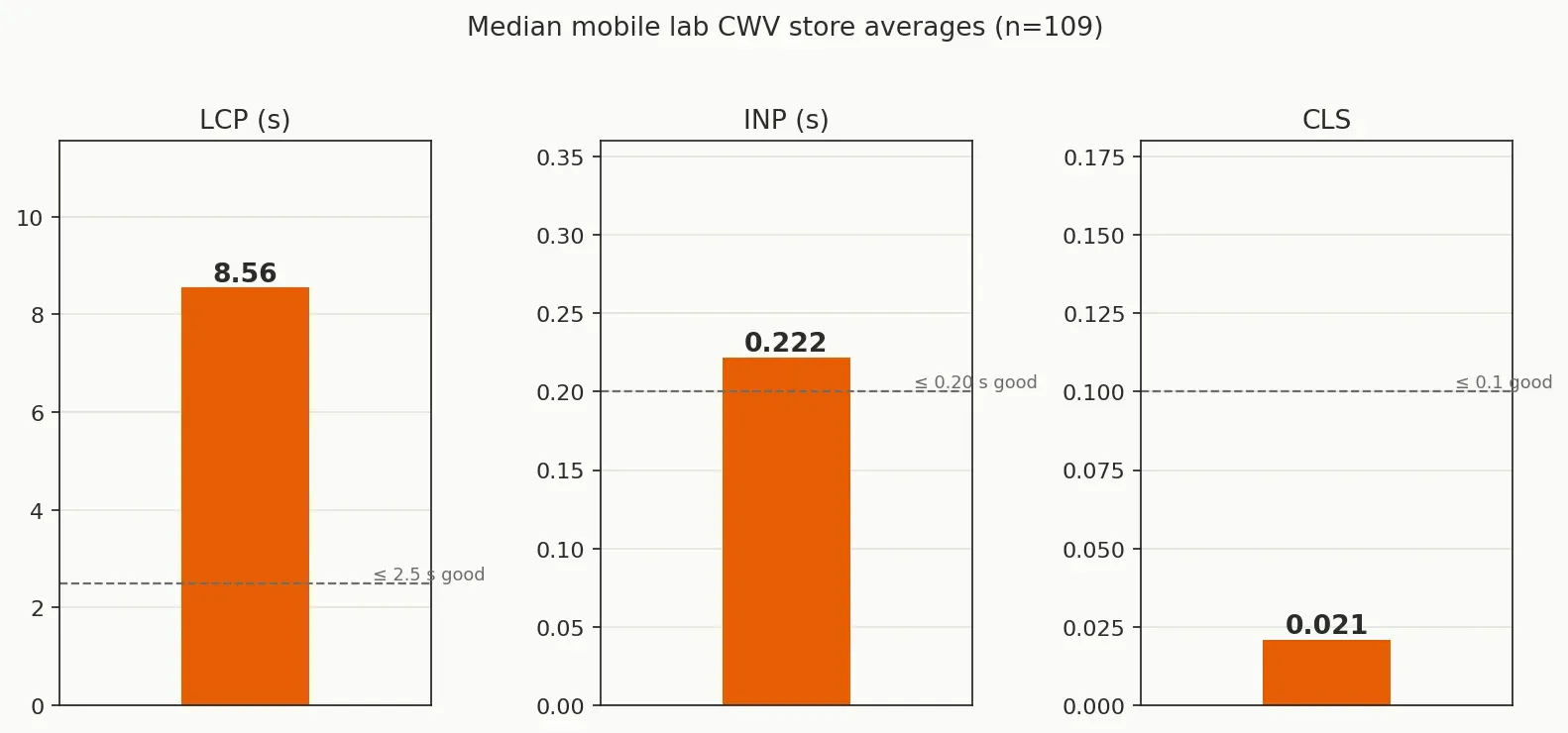
CLS is the bright spot. INP at the median sits just above the “good” lab line, so interactivity needs attention on more than half the book once you leave the best quartile. LCP is the structural problem: only two sites average ≤ 2.5 s across the selected pages under lab throttling. That lines up with public CrUX stories that blame loading more than layout shift on Webflow origins once sites leave the quiet end of the traffic distribution, and with the retainer reality that large LCP images, IX2 interactions, and third-party scripts dominate the first paint path.
Read the Lighthouse Performance score as a companion signal, not as Core Web Vitals themselves. A mobile store average near 55 usually means several URLs in the set are spending heavily on LCP and main-thread work under lab throttling. Desktop medians near 78 do not cancel that; they only explain why a client who tested on a fast laptop still thinks the site is “fine.” When you brief stakeholders, pair the Performance dial with the LCP row so the conversation stays on the metric Search still cares about.
Recurring mobile Lighthouse opportunities
Opportunity | Sites (of 109) |
|---|---|
Reduce unused JavaScript | 107 |
Reduce unused CSS | 95 |
Avoid multiple page redirects | 26 |
Minify CSS | 15 |
Minify JavaScript | 10 |
Initial server response time | 1 |
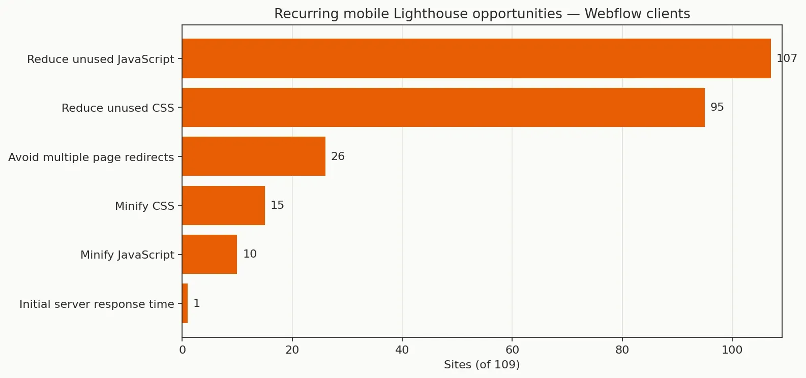
Unused JavaScript and unused CSS appear on almost every site in the sample. Redirect chains show up less often than in our WordPress cohort, which still had redirects on most stores. Server response almost never appears as a named Lighthouse opportunity here, which does not mean TTFB is fine in the field; it means the lab opportunity list is dominated by front-end weight once the document arrives from Webflow’s edge. For the hosting-versus-front-end argument agencies still have with clients on other stacks, see WordPress Site Slow? It Is Not Always the Hosting as a parallel pattern: the named lab queue is rarely “change host first.”
In practice that points at a short fix order for Webflow retainers. Start with the LCP element on the worst URLs in the domain report (image size, format, and whether the hero is the real LCP candidate). Then cut unused JavaScript and CSS that travel with every CMS template: marketing pixels, chat widgets, animation libraries loaded site-wide, and Designer classes that ship to pages that never use them. Only then spend time on redirects and minification, which appear on far fewer sites in this cut. Webflow’s performance panel and asset settings help, but they do not replace a multi-page re-test after each publish.
How to use these Webflow benchmarks on a retainer
A useful next step is to open one client domain report and compare its mobile Performance average and lab LCP to the medians above. Sites well above a mobile Performance of 55 with lab LCP near the good line are not the priority queue; sites below the median with unused JavaScript repeating across CMS templates usually are. That single comparison is enough to decide whether the next sprint is LCP work or quiet monitoring.
Budgets stay clearer when they name the artefact: lab LCP and Performance on a fixed URL set, reviewed on a schedule, with field CrUX added when the origin has data. The Complete Guide to Performance Budgets for Web Teams covers threshold design, and PageSpeed Monitoring: How to Schedule Test Frequency and Priority Across Your Portfolio covers cadence across many Webflow clients. Homepage-only PageSpeed Insights understates template drag, so the cost of inaction is another quarter of retainers argued from “Webflow should be fast” instead of a shared baseline.
A practical reporting rhythm looks like this. Once a month, regenerate or review the domain report for each Webflow retainer, note where store averages sit versus the cohort medians, and list the two URLs that pull LCP the most. Put those URLs and the unused-JavaScript opportunity into the sprint board with an owner in Webflow Designer (or custom code) and a re-test date. When CrUX is available for the origin, add the field p75 row beside the lab averages so the client sees both clocks without confusing them. That is the layer-don't-replace pattern: Webflow hosting and Designer tools stay; Watcher supplies the multi-page schedule and the evidence pack. For the full dated multi-cohort table (Shopify, Magento, WordPress, fashion, Attention-Free) plus Google and platform field context, see 50+ Core Web Vitals Statistics for 2026. Keep the Webflow lab medians from these tables beside those figures when a client asks how their stack compares, and say which clock you are quoting before you quote a number.
FAQ
Do these lab averages mean most Webflow sites fail Core Web Vitals in Search?
No. Lab store averages and CrUX origin pass rates are different clocks. Public HTTP Archive rebuilds still show a large share of Webflow origins passing all three vitals on mobile. The Watcher sample shows how multi-page lab averages look on client Webflow stacks under throttling. Use lab numbers for remediation queues and CrUX for Search claims.
Why is median lab LCP so far from 2.5 s?
Domain reports average many templates. Heroes, CMS collection layouts, interactions, and embeds that repeat on secondary URLs pull the store average up even when one campaign landing page looks acceptable. Lab throttling also stresses image and script weight harder than a fast office connection, which is why the gap to the 2.5 s “good” line is wide in multi-page averages.
Is Webflow faster than WordPress in Watcher’s samples?
On median mobile Performance, this Webflow client cohort (55) sits below our WordPress client cohort (62) and close to Shopify (51). Public CrUX pass rates often favour Webflow over WordPress. Prefer same-method comparisons over mixing CrUX pass rates with lab averages, and remember that our WordPress sample is much larger (381 sites), so treat the gap as orientation rather than a ranking of platforms.
Should we chase unused CSS before hosting?
In this opportunity list, unused JavaScript and unused CSS dominate. Webflow hosting still matters for edge delivery in the field, but the lab queue on these client sites is mostly front-end weight and asset hygiene, not a server swap. Fix LCP candidates and shared script weight first; revisit hosting only when field TTFB or edge configuration shows up in CrUX or real-user traces.
How does this relate to Webflow’s own performance panel?
Use the panel for Designer-side checks on a page you are editing. Use a multi-page domain report when you need portfolio evidence across templates. The panel does not replace store-level averages, and store-level averages do not replace CrUX when you are talking about Search.
How to act on Webflow Core Web Vitals benchmarks
If you manage Webflow clients, the useful move after these tables is to pull one domain report, mark where it sits versus the medians, and put lab LCP plus unused JavaScript on the next sprint board with a scheduled re-test. Leaving the book on homepage-only screenshots keeps the "Webflow is fast" claim untested across templates, which is the expensive failure mode for retainers — the cost of inaction is another quarter of retainers argued from "Webflow should be fast" instead of a shared baseline. PageSpeed Monitoring: How to Schedule Test Frequency and Priority Across Your Portfolio is the operational companion for cadence, and The Complete Guide to Performance Budgets for Web Teams covers how to name thresholds clients can accept. Start a trial at sign-up when you want that multi-page lab baseline on a schedule rather than another one-off homepage PageSpeed Insights run.
References
Understanding Core Web Vitals and Google search results (Google Search Central)
Core Web Vitals Benchmarks for Shopify Stores (2026 Data) (Apogee Watcher)
Core Web Vitals Benchmarks for WordPress Sites (2026 Data) (Apogee Watcher)
Core Web Vitals Benchmarks for Magento Stores (2026 Data) (Apogee Watcher)
Core Web Vitals Benchmarks for Fashion Stores (2026 Data) (Apogee Watcher)
What Are Core Web Vitals? A Practical Guide for 2026 (Apogee Watcher)
The Complete Guide to Performance Budgets for Web Teams (Apogee Watcher)
WordPress Site Slow? It Is Not Always the Hosting (Apogee Watcher)